




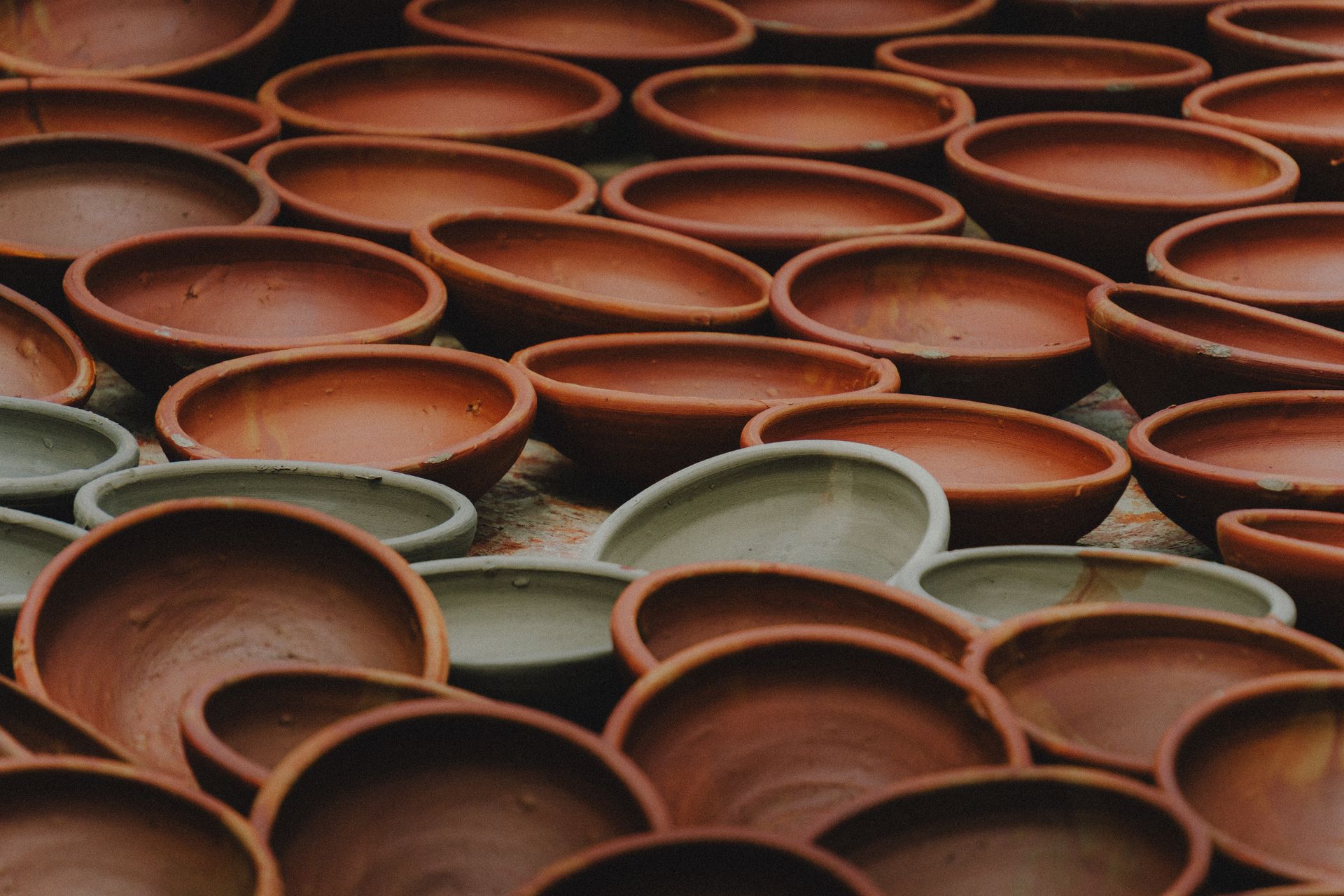
Interiors are warming up, and not in a passing way. Ochre, caramel, clay and terracotta are appearing in paint forecasts, tile collections and finish schedules as the foundation of a scheme rather than a single feature wall. The direction is away from trend-driven statements and toward rooms that feel settled and are designed to age well.
What the 2027 colour forecasts are saying
The clearest Australian signal is the Dulux Colour Forecast 2027, released in September 2026. Curated by the Dulux Colour Team, led by Colour and Design Manager Lauren Treloar and Colour Marketing Lead Lilybet Holt, it presents three palettes: Play, Treasure and Sensory.
Sensory is the earthy one. It pairs botanical greens such as Dulux Moorland and Dulux Field Maple with deep browns including Dulux Sweet Chocolate and Dulux Dark Cocoa, softened by the muted tan of Dulux Barite and the warm wheat tone of Dulux Buttercookie. ArchitectureAU notes the palette draws on Japanese influences and conscious craftsmanship.
It builds on a direction already visible a year earlier. The Dulux Colour Forecast 2026 Elemental palette layered warm whites with golden browns such as Dulux Caramel Sundae and Dulux Coffee Dust, while its Evoke palette leaned on Dulux Baked Clay, the orange of Dulux Magic Melon and the mustard gold of Dulux Germania.
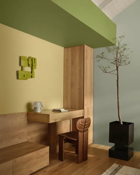
Image: Dulux Forecast Sensory Palette 2027
Brown has become a neutral
The major international paint houses have moved the same way. Benjamin Moore named Silhouette AF-655, an espresso brown with charcoal undertones, as its Colour of the Year 2026 on 16 October 2025, linking the choice to renewed interest in classic tailoring and in the brown colour family. Sherwin-Williams chose Universal Khaki (SW 6150), a warm mid-tone tan, for the same year.
The common thread is that warm browns and tans are now being positioned as base colours, the role grey played through the 2010s.
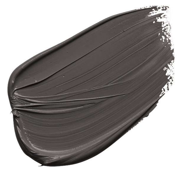
Image: Benjamin Moore's Silhouette AF-655
What to expect from Pantone in December 2026
Pantone has not yet named its Colour of the Year 2027, and the announcement is expected in early December 2026. The Pantone Color Institute traditionally reveals its pick in the first week of December, and its 2026 choice, Cloud Dancer (PANTONE 11-4201), was announced on 4 December 2025 as the first white in the programme's history. The year before, Pantone chose the brown Mocha Mousse (PANTONE 17-1230).
The 2027 selections already announced lean toward nature. Sherwin-Williams named Celery (SW 6421), a soft herbal green, on 15 September 2026, and PPG chose Country Soil (PPG15-30), a warm neutral it links to clay-rich earth and weathered stone. Behr has gone with a deep olive called Grounded, while trend forecaster WGSN and colour system Coloro named Luminous Blue.
Pantone's own research offers the best clue. Its Pantone View Home + Interiors 2027 forecast, presented by Pantone Color Institute executive director Leatrice Eiseman at The Inspired Home Show in Chicago earlier in 2026, includes an Honest palette of browns, reds and oranges and a Grounded palette of organic earth colours.
Our read is that a warm earthy mid-tone, a terracotta, clay or ochre-leaning gold, would sit comfortably with both Pantone's forecast and the wider industry, with a blue in line with WGSN's choice as the main alternative. Either way, Pantone's pick is a cultural signal rather than a specification guide, so treat it as context for client conversations rather than a reason to rework a palette.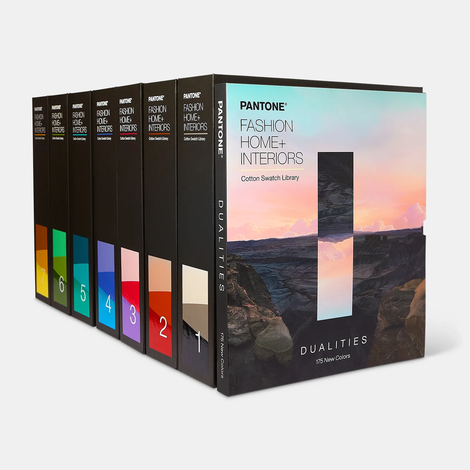
Image: Pantone's FHI Cotton Library + Dualities Expansion Pack is the ultimate reference tool
Why earthy palettes age well
Earthy hues last because they come from materials. Ochre, clay and terracotta take their names from natural pigments and fired earth, and they sit comfortably beside timber, stone, linen, leather and lime-based finishes that gain character over time.
That is the key difference from statement colour. A saturated trend shade can date a room within a few years, while a tonal scheme of clay, caramel and warm white tends to absorb wear, changing furniture and the patina of natural materials without needing a repaint.
There is a local dimension too. Ochre carries deep cultural significance for Aboriginal and Torres Strait Islander peoples, and the Australian landscape of red earth, sandstone and dry grasses gives these colours a sense of place that cool, imported palettes rarely offer.
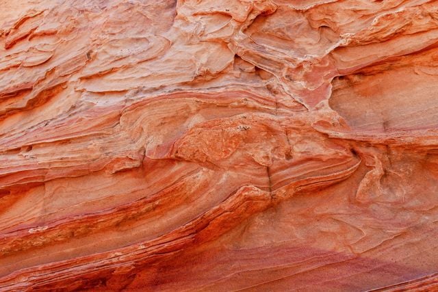
Picture: Detailed texture of vibrant red sandstone rock, showcasing natural erosion patterns. Credit: Rino Adamo
Why this matters for the Australian market
For suppliers, the material story is the product story. Earthy palettes reward provenance: where the clay was fired, how a finish ages, how much natural variation to expect between batches. Brands that can explain this clearly, and show it in large samples, give Architects & Designers the confidence to commit.
Make technical data easy to find. Publishing LRV values alongside colour names, and noting which products pair with forecast palettes such as Dulux Sensory, removes friction at the shortlisting stage and helps a product stay in the specification through to construction.
For Architects & Designers, ask the ageing question. Request information on how a surface weathers, how it is maintained and how it looks after five years, not just on day one. Check luminance contrast early in tonal schemes, and treat colour, light and accessibility as one conversation, which also makes it a strong CPD topic.
Seeing warm finishes in person, under real light and beside real materials, is still the best way to judge them. Browse The-Arc events calendar to find an upcoming event near you, including The-Arc Gold Coast Interiors in November.
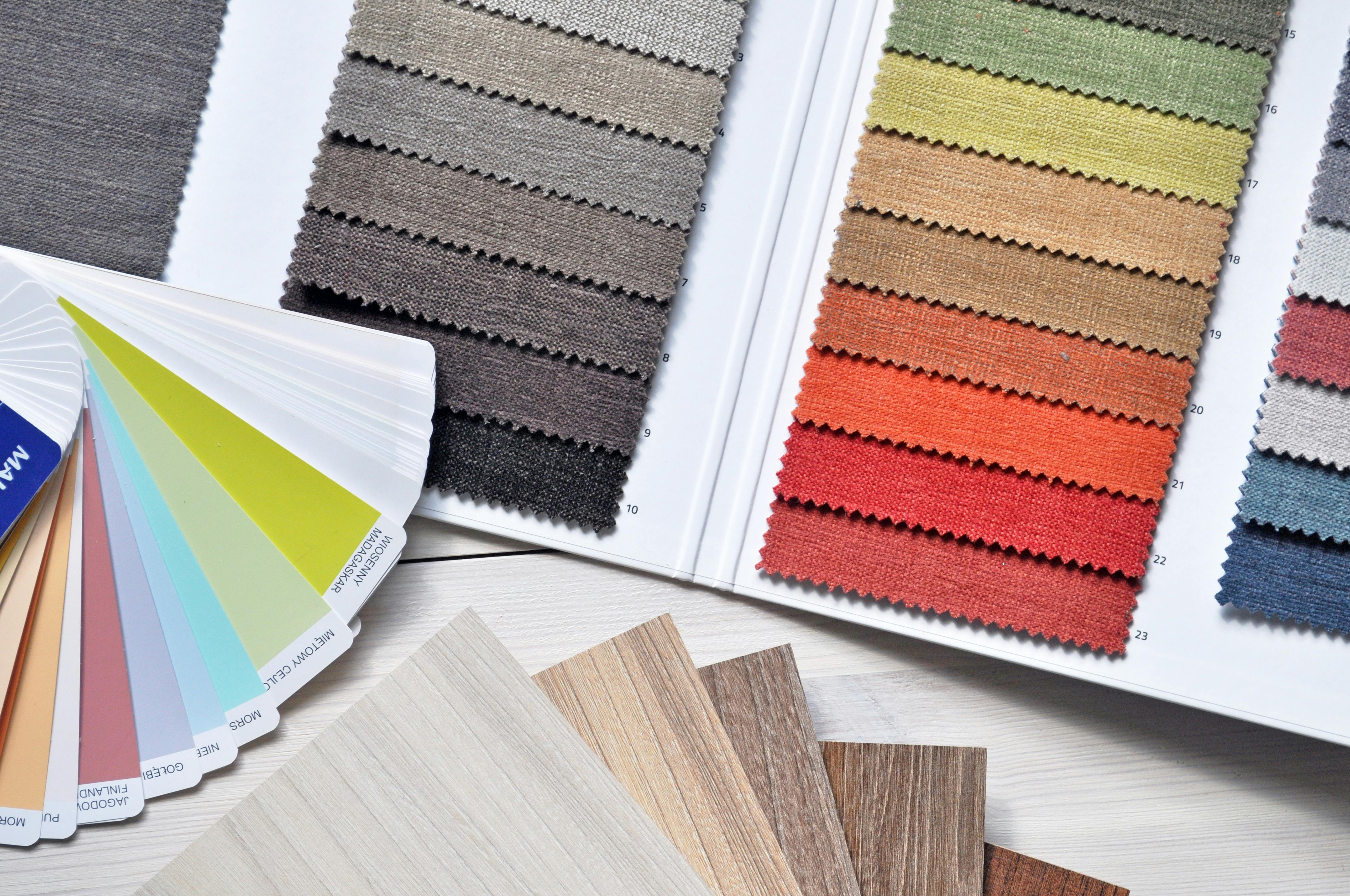
Interested in exhibiting at The-Arc Gold Coast Interiors this November? Find out more here.